Marketing communications (Marcom) dollars are like ants; they need to lift 100 times their own weight to be doing their job well. In health care organizations where Marcom budgets are small, there’s often little allocated for measuring the impact of those dollars.
If we fail to show the value of our efforts to senior leadership, this can be a slippery slope for those slight Marcom budgets. It’s likely that we’ll see our budgets stagnate, if not shrink.
Fortunately, there are free, or low-cost, data sources and tools that you can use to show your executive team an impactful Marcom investment. While it may take a few years of shoe-stringing it, hopefully you will be able to illustrate the potential for your organization.
Break it Down
It’s always good to make sure that both your executive team and Marcom team are speaking the same language. SHSMD’s white paper “Life Beyond Promotion: Core Metrics for Measuring Marketing’s Financial Performance” is a good place to start.
However, if you’re working with a disproportionately small Marcom budget (“By the Numbers, 2014” found that stand-alone hospitals averaged marketing communications budgets of 0.63% of net patient revenue in 2013), you may need to go a step further and educate your executive team about how Marcom activities fit into the sales funnel.
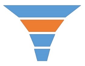
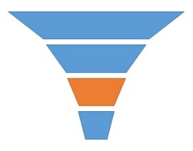
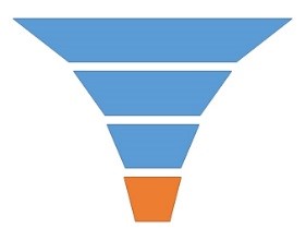
I’ve adapted a sales funnel from Triad Consulting Group to reflect our organization. This shows the relationship between consumers’ needs and expectations and the organization’s actions. I use this as a skeleton to hang data from so that everyone can see where our efforts fit in the overall picture.
Awareness & Recognition: Measuring Impressions
 To quantify the top level, “Build Awareness & Recognition,” I focused on passive impressions. That included the number of news stories, ads, and direct mail pieces, and the audience reached. Here’s what I did to get the data:
News stories: For print articles, use circulation numbers from the advertising rate cards most newspapers and magazines have on their website or contact someone from the paper and ask.
Some radio stations publish their listenership numbers on their website, but I’ve found it most useful to ask my ad reps to share TapScan data from Neilsen. It will include the “Average Persons” listening in any given 15 minutes during certain hours of the day.
Online articles are trickier. Without having access to the outlet’s web analytics, this is not an exact science, even for good PR tracking tools. This is where there’s the largest leap of faith and I am sure that my solution will make analysts cringe. If you happen to know a better way, please help us shoestring marketers by providing a better work-around for estimating online pageviews. Here’s what I did to reverse engineer one PR tracking tool’s formula:
- Using a free trial with a PR data tool, I recorded estimated views on some articles (article views). I used this information and the domain’s overall pageviews on SimilarWeb to create a view rate for each website by dividing article views by domain pageviews.
- I then plotted the view rates for each article and used Excel to find a trend line that fit my data best. The R2 (R-squared) on my trend line was greater than 0.9, which suggests that trend line may be a good model.

- Using the trend line formula 713 x Pageviews-0.689 = Estimated view rate, I was able to make my own estimate of article views for future article

- Then, by multiplying the domain pageviews by the estimated view rate, I could estimate the article views on these and future articles. (Google Alerts and Google News are free tools you can use to keep track of news about your organization.)

You may notice that the article views I calculated differ from those generated by the PR tool when looked at individually. However, when comparing total article views, my calculation is just 5% lower than the PR tracking tool. Given that we’re all just estimating, I’m willing to accept that variance.
Advertising: Impressions from print and radio advertising can be estimated in the same way as news stories (see above). For web ads, you should have data from your advertising partners, Google AdWords, etc.
Direct Mail: This one might be the easiest yet. All you need to know is how many direct mail pieces you sent. This will not help you understand if your direct mail campaigns were effective, but that’s not what we’re measuring at this level of the sales funnel. We just want to know how many people were exposed to our messaging.
Interest & Position: Measuring interactions
 In the second tier of the sales funnel “Creating Interest & Position,” I was looking for engagement with the organization. This included reactions on social media, pageviews on the organization’s website, and the number of people attending events. You could also include e-newsletter engagement.
Social Media: Each social media platform supplies you with some measure of impressions and engagement. I prefer to use engagement (Likes, Comments, Shares/Retweets) versus views because at this level, we’re trying to gauge people’s relationship with the organization.
Website: In evaluating the quality of your web traffic, you may look at several metrics, including users, pages per visit, average time on site, bounce rate, etc. However, in measuring the interactions with your website, I would stick with pageviews. This gives you an apples-to-apples comparison with your social media engagement metric.
E-Newsletters: Email offers us a great opportunity to target and track communications with our patient base. In my mind, open rates are a measure of impressions and click-through-rates are a measure of engagement. Both are important to look at in your quest to improve the quality of your communications, but click-through-rates are a better measure of the relationship your audience has with the organization.
Events: To measure attendance at events like classes, health fairs, open houses, lectures, etc., you will might use ticket sales, RSVPs, sign in sheets, registration numbers, etc. Occasionally you’ll need to estimate the size of a crowd, with a rough headcount. To do this, I pull on my past work in ecology and count the number of people in a section of the crowd, then I multiply that by the number of sections I see. It’s rough, but it’s the best way to quantify a milling group of people.
 Referral & Trial: Patient Use of Services
In tier three of our sales funnel, we hope to see patients moving from awareness through interest and into trialing our services. You may quantify this in several ways, including call volumes, new patient visits, clinic visits, etc. It really depends on how your organization is measuring operational success.
Evaluate: Patient Preference and Revenue Growth
Tier four is all about the positive feedback loop of good patient experiences and the bottom line. As the saying goes, “Money talks.”
 Using gross patient revenues from your finance analyst, you can show revenue growth by comparing gross patient revenue before the campaign and after the campaign. This can be particularly effective when demonstrating the impact of a service line campaign.
In cases where you have no historical revenues to use as a baseline, such as the launch of a new service line, you may be able to refer to projected profits from the business plan. (Ask your finance or business development team for the pro forma statements.)
If your leadership values being the “Hospital of Choice” in your community, you can approximate this with market share data. Here in Oregon, hospitals are required to submit claims data to the state. The state then makes this information available to the hospitals for a small fee. While the data is typically six to nine months old and does not include stand-alone ambulatory clinics, it is useful in evaluating shifting patterns in patient preferences.
Other metrics that might resonate with your leadership include HCAHPS scores or patient satisfaction surveys.
Make that Data Dance
Let’s face it, when you are part of a smaller organization with a limited budget, you’ve got to get creative. Even if you’re a one-person operation, be sure to carve out time to quantify the impact of your efforts.
By showing a return on those marketing communication dollars, you are helping your organization to value marketing as a revenue driver, rather than an overhead expense.
Be sure to present this information to your leadership team at least once a year.
By Felicia Struve | Posted June 20, 2018
SHSMD Digital Engagement Task Force Member
Marketing and Communications Coordinator
Columbia Memorial Hospital
Astoria, Oregon